
Workable
Creative Director
Jan 2019 - Dec 2021
HIGHLIGHTS
Led teams of managers, visual designers, engineers and video producers.
Worked with leadership to rebrand digital properties and doubled audience reach to 3M+ per month.
Created a unique illustration style and motion library to represent the product and capture the rich diversity of the platform’s global audience.
Developed tools, templates and iterative workflows to enable stakeholders to launch and test content in market.

Building from
the ground up
INITIAL CHALLENGES
The existing brand had an outdated design and technology stack.
Brand design processes did not exist, team had low morale and communication with cross functional teams was broken.
SETTING THE STAGE
Started working with the leadership team to kickstart a new positioning and brand redesign project.
Moved to Athens, Greece to work closely with the team and to identify processes that empowered them.
Supported the team leads to engage marketing and engineering leadership to improve collaboration.

Focus on the product
BRAND LOOK & VOICE
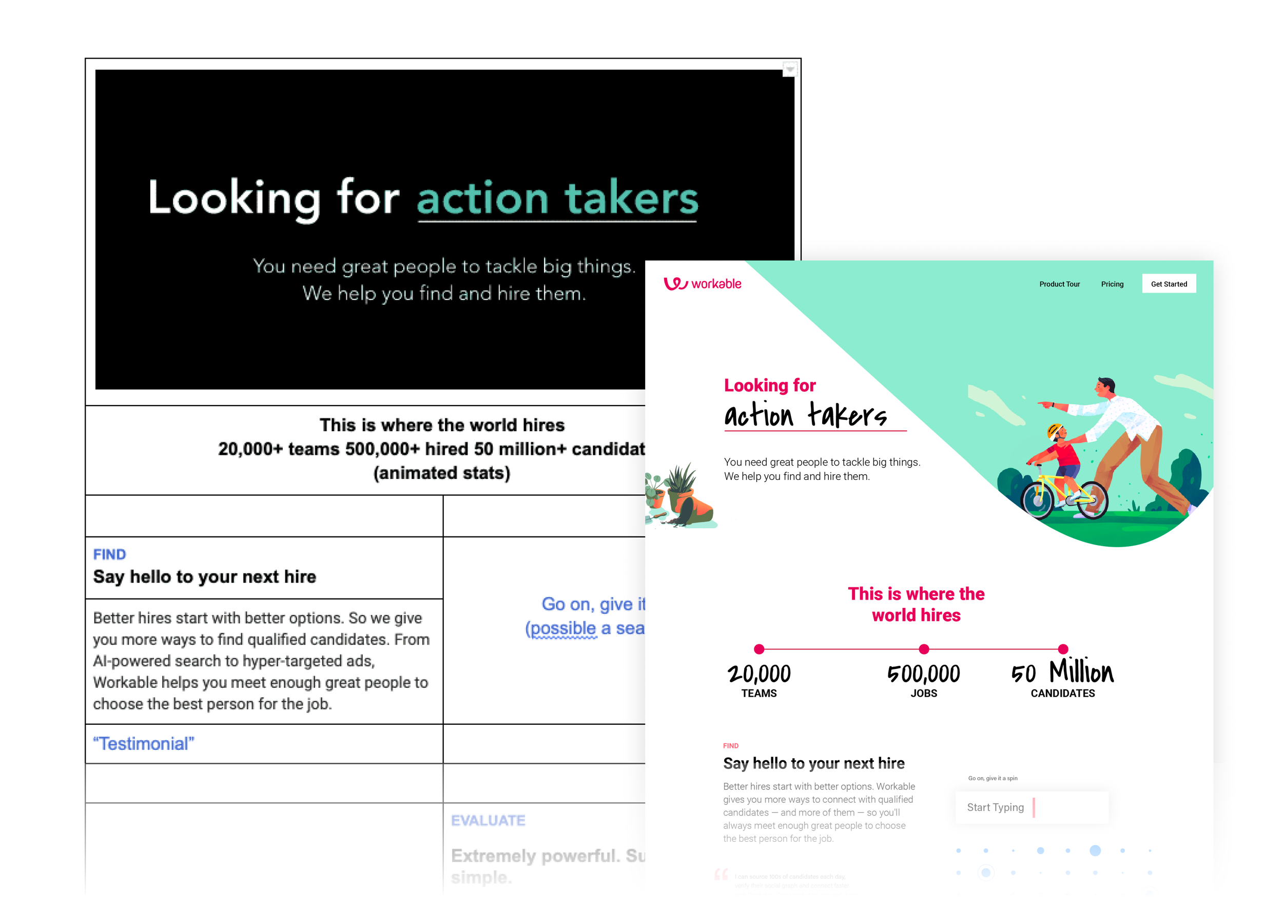
The new brand developed around the idea that our customers need great people to tackle big things and Workable helps them find and hire the best candidates.
With 85 million candidates hired and 20,000 companies hiring through the platform, the new illustrations focused on people in different stages of hiring. The updated color palette represented a global audience and the spaces in which hiring happened.
NEW WORKABLE.COM
The new site was a custom built CMS on Next.Js/React paving the way for a seamless experience between brand and product.
Find & attract, evaluate & collaborate, and automate & hire (represented visually by a circle, square and triangle) became the containers for how features and solutions were discussed.
To accelerate growth and brand awareness, the team collaborated closely with channel managers and monitored reports to drive optimal performance. With a test-and-learn approach, tools like Hubspot, Hotjar and Google Optimize helped measure and iterate on creative and messaging.

Mapping old content to
create new architecture
Early content blocking
and prototype

Evolving navigation to capture products and solutions

Make hiring engaging and human
Typically, platforms in this space rely on stock photography to tell their story. To differentiate the brand, my team developed a unique illustration style in partnership with Estudio Santa Rita. Brush strokes, plants, pets, etc. added warmth to the scenes. The color palette was also extended to capture the rich diversity of the platform’s global audience.
Lottie was added to the stack to bring focused motion to product screens. Lottie was used even further to bring the icons to life. Eventually, this motion design language ended up in brand videos. The geometric shapes were a natural fit for the transitional elements used in the brand’s storytelling.


Exploring illustrations to use for new website hero

Illustration and icon systems for brand and product surfaces


Micro animations to bring stylized UI elements to life
Not all content is the same

CONTENT THAT CONVERTS
With over 3 million visitors a month, resources.workable was a huge platform for the Workable brand. Not only did the Wordpress based site need to be brought up to new brand standards, the structure and consumption of the content needed to be reimagined. An editorial plan was developed in partnership with Content and SEO teams to support articles with videos, images, infographics, etc.
This process, which was led by design, took over four months of content audit and remapping, and partnership with data analytics and SEO optimization teams. The end result was a powerful platform that seamlessly scaled to accommodate various content types, audiences and contributors.

